Time’s not working for us (too fast), nor is the outside temperature (32C today)… so render power is very low now.Nevertheless, a lot of progress has been made, with the last gaps in the film being filled in. One more week to go! Here’s the usual random picks from the weekly presentation folders.

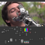
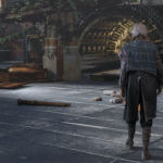
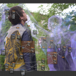

The 5th one looks kinda crappy. Please tell me your going to fix that.
Hm. What if we don’t?
Hello! I do not know to whom to write, therefore I write to you.
Blender testbuild 2.64-2(and others)
Ubuntu 12.04 64bit, Cycles render, CPU compute, Mesh->ParticleSystem->Render Emitter is OFF-> F12 -> CrashBlender.
Ubuntu 12.04 64bit, Cycles render, GPU compute, Mesh->ParticleSystem->Render Emitter is OFF-> F12 -> No emitter and no particles.
Tell Sergei. maybe he will look at this.
please report bugs to the blender bug tracker:
http://projects.blender.org/
Then we will send a robot to your house that can only say four word. “Make It MOAR REAL!!!”
I didn’t mean you guys are bad at this,(Because I cant do anything like that.) but something looks odd about it. sorry to pull your leg, I know you only have a week left.
A remark like “looks kinda crappy” is offensive to the people who put time in it and not at all constructive. Why not try to be a little bit more constructive?
Okay, I’ll bite. The gunk on the robot is layered incredibly thick and the shader is very matte, almost as though it was made of plaster rather than steel. Yet, despite all that gunk, it somehow manages to look too clean – it’s as though all the individual parts it’s made out of had been getting banged up and dirty separately and were put together just moments before. Normally when you have a mechanical object made of many parts, the most outer parts will shield the inner ones from damage and dirt. Of course, with just a week to go, it’s probably not feasible to retexture it. Perhaps take the nice dirt shader script and use it as a mask to tone down the dirt and damage in the more shielded places? How’s that for constructive?
Yup. It looks like cement, concrete, clay, or duct tape rather than steel. Then you see the robot’s eyes which are way too geometrically/mathematically “perfect”. But I’m really liking the simulated focal blur, right down to the chromatic abberation. Maybe that’s what is giving away the illusion that it’s fake is that it’s too in focus. Notice that even when you take an ultra high-resolution photo with a DSLR that at pixel level it’s still not ultra sharp. However, when you render a virtual object in 3D, mathematically, everything is mathematically sharp. So when you downscale that into a smaller image, the sharpness becomes exponentially obvious. That first shot, however, is really nice. Still a little “floaty”, but should probably be on the DVD cover. It’s so effective.
Now that is indeed constructive.
Looks like Benn’s finally so nice to reveal himself http://bennsartt.blogspot.nl/
Yes, I have to say that it feels like the quadbot is supposed to look like it has been beat-up, but instead it looks like it just had a go through the Photoshop liquify filter.
That being said, your “looks kinda crappy, fit that” comment is kinda crappy.
Al rite poor choice of words. It’s just that the robot looks like its made of concrete instead of steel. Again sorry to pull your guy’s leg, I mean you only have a week to go.
Oh and thanks MadMinstrel and Eastfist for backing me up. :)
I just wanna be awesome in space … ;)
I’m little bit afraid of the fact, that you want to make it the most photorealistic as it is possible. I hope that you hide the best results for the premiere :) And there is some 80% done stills :)
What people tend to forget, it will look a lot different when its all in motion. Picking every detail of every frame for critique might not even make a visual difference when its played back at 24fps :)
Its looking very promising, is there any kind-of-settled date for online premiere yet?
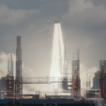
What is the fourth one? A spaceship blasting off? I don’t remember seeing that shot before. Where does that come in the movie? Perhaps it was a slip to show that… ;)
I was thinking the same thing.
i think its planned for the pre-breakup amsterdam going off in the background as Thom says “i just wanna be awesome in space”
Amazing! Absolutely amazing! Especially the boom pic!
everything looks awsome, the 5 image also looks awsome
Why don’t you just admit that you’re freaked out by my chopped off hand.
Haha, well spotted *grin*
I really like the image where Celia transforms. Is the smoky veil-like look is achieved using BI?
Yes this part is done with Blender Internal. The “smokey” bits are just motion blurred overlays though, nothing fancy.
.andy
The picture of the robot needs some more dramatic lighting (maybe a nice rime light from the left side?), a little less bump and more reflection. But what really bothers me are the eyes, they look like plain glowing discs. I’d suggest adding a pixelgrid over them with some aberations or make them a bit transparent and reveal some of the tech behind.
I have to agree in that the 5th shot lacks realism. Maybe not in the lighting, but in the shaders. To me it seems like one big opaque shader with a texture. No specular changes, shiny little parts, oxid, rough other parts, broken little peaces, etc. I think this robot could use some more shader layers with more intentioned maps for them.
so many good suggestions…
I’m guessing that robot from the 5th shot is midway through transformation started in the 3rd shot which is why is has some pink/purple on it. Cool effects!
Completely agree with Manuel L. And not only “picking every detail of every frame for critique might not even make a visual difference when its played back at 24fps”, but it does make a lot of difference in render times if you don’t make compromises. Rendering every frame to a still-quality level is unfeasible. If those compromises are barely noticeable at 24fps, it’s a win-win :)
PS: My first comment on the blog and I don’t even say how much I am looking forward to seeing the final result? I am REALLY looking forward to seeing the final result :) We’ve seen some fantastic stuff being posted and I find it awesome that the story is still completely unspoiled. Good luck for crunchtime!
I think pic 0083 should have a speech bubble. “You think my arm looks bad? You want to see what’s growing out of your head!”
What Ubuntu did you use with the GTX580s?
(I tried 12.04 with unity with not much luck)
And yes I know this might be the wrong place to ask, but hey!
Can’t wait for the for the final movie, looking good guys
I hope I don’t annoy you but do you have a date when we can see the finished movie online?
Magnificent site. Lots of useful information here. I’m sending it to several buddies ans additionally sharing in delicious. And naturally, thanks for your sweat!