So- this last week has by far been one of the most rewarding! We’ve finally primed the pump, and renders are coming out of the farm in a steady flow. We have about 140 seconds of ‘finished-ish’ film- stuff that’s come out of the farm, and more or less works (though in a lot of cases we may through it through the farm again, just to fix something small). Meaning- we’re actually on schedule! For now….
For time-based effects and problems, we can’t see if they work or not till we send them through the farm- and sometimes the farm itself introduces glitches- so we’ve been doing lots of re-renders. But the farm’s keeping up!
I think it’s kind of amazing, actually- all of our posts have been showing the same old stuff over and over (even now I’m just kinda reposting some things you’ve seen before), but we have a ton of new finished stuff sitting around. I should upload some of that. Later!
That said: So many cool final shots! So I’m gonna do a super lazy blog post and just put up some framegrabs!
ALSO: Teaser next week?
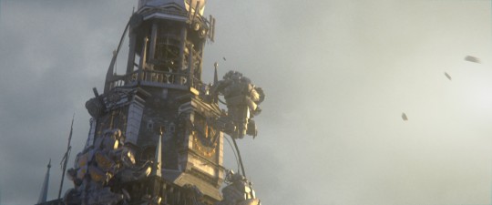
Robots climb the church tower! Check out the eyes Kjartan painted on the back of one of em. We’re making all of the robots a bit more individualized.
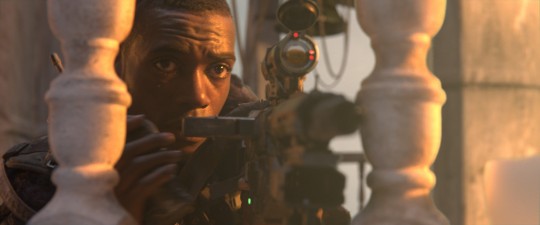
This one is almost done, apart from the slight white fringe around the keying! (Keying is hard, man). The scope is animated a bit to keep auto-focusing as he moves the gun around.
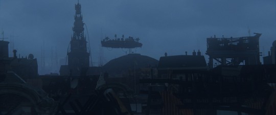
Rob’s insane city.
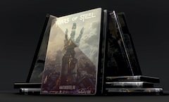
And one shot…. (still a bit of a WIP- but mostly done).


WOW! Beautiful! :D
The robot shot looks epic! I’m looking forward to the teaser. Would that have the title?
Yes!
great stuff I can’t wait!
Too much camerashake in the shot for my taste, half would be enough.
Other than it looks fantastic! Great to see how it is coming along.
Amazing stuff. The robot climbing the tower is superb – very King Kong!
There’s still a Chrome bug on this site where YouTube videos overlap the enlarged thumbnail images (not present in Firefox).
Fix: append “&wmode=transparent” to the YouTube URLs.
very exciting, and yes, I agree, keying is hard :-S
The eyes of the robots are seem to dilate in the reverse direction. Looking up to the sky an eye’s pupil would get smaller, and looking down in to a darker shaded room it would get wider. Even if they were just flashlights, flashlights counter the amount of not-present light in an environment so they would mirror the behavior of eyes — not reversed. …Right?
The guy with the gun is a lot braver than me, too. That’s not a problem; that’s an awesome.
It could be that the ‘lamps’ in the eyes are actually cameras, and so are sort of zooming in to focus on the face of the character more, but I agree it looks a bit odd. But absolutely fantastic work! I am so looking forward to this :p
looking very nice, one thing thought why you dont add sparks when the bullets hit the climing robots i see there is fire coming out of the gun but what about when they hit the robot, i think abit of sparks and maybe scratches and bouncing bullets of the robots will be more dramatic and real?!!
other than that i love it cant wait anymore (~,~)
YES! I agree, that would make the shot another step up!
How about adding empty bullet cases popping out of the gun ?
Or even dents or holes- non-effectual guns in movies make the guns seem weak and pointless, and/or the the targets invincible and boring.
Haha, aye! It’s super easy to think of details to add- but a lot harder to balance them against the post-production schedule of the entire rest of the film. We’d spend 4 times as much time on every shot, if we could! But we have 110 shots to do! We try to do what we can :)
Have you thought about crushing the darker tones a little? Almost all CG from ten years ago and still in many movies/games today looks really fake and CG because every detail in every shadow is clearly visible in the same shots where details on surfaces with direct sunlight are also perfectly graded.
That tower screen shot has a minimum brightness of 28 and max of 250- the 28 seems way too high.
Absolutely! This is the initial look we’re going to have, but there’s still a final grade we’re going to do in the end. We’re trying to make sure we don’t mess around with the dynamic range too much at this point, so we stil have as much to work with.
Those brightness values are only representative of the dark jpeg we exported :P
Awesome! And the great thing about this project is that I or someone else could always make a super contrasty version to our preference later on.
Great stuff guys, what about motion blur in the first pic!? How did you achieved that in Cycles?
we used the vector blur node and cylces speed pass
Cool, thanks for the info, keep up guys.
Kind regards
Amazing! :O I must say, I never really thought that the end result would look this good (and I suppose that I ahve seen nothing yet :D)
One question; the noise levels looks really, really good to me in these few screenshots. Have you just ramped up the samples to insane levels or have you come up with some solution/method to fix it? Because the noise is basically my only real complaint about Cycles as it is since I can’t seem to get rid of it (with decent render times, that is).
getting rid of noise in cycles can be a bit tricky, and blurring everything isnt the perfect solution either. brecht gave a good starting point for avoiding noise here: http://wiki.blender.org/index.php/Doc:2.6/Manual/Render/Cycles/Reducing_Noise
howver, in most of the shots we also use bilateral blur on the diffusion and glossy passes, which are rendered seperately, and then combined together with the emission and alpha pass.
.andy
This is a good video on reducing fireflies: http://www.youtube.com/watch?v=I3r8jnAQH7g&feature=plcp
I feel a bit bad for saying so, but I was also not expecting it to look quite this good. Now I’m even more psyched for the dvd!
what you need now is a big fat juicy GPU accelerated VSE/ video editor, that can help from a render that takes 10hrs to being 5hrs(i’m talking about your final edit)….is this already possible in Blender VSE
This is amazing. Can’t wait for the finished product!
This is looking awesome. I saw some of the weekly meeting where the film-so-far was shown too. The story is great. Everything seems to be coming together. Keep it up!
Awese, guys!
That’s got an Ian Hubert feel to it for sure. Awesome.
YES! Look’s great!
The next weekly is approaching, but no teaser yet :( mouthwatering posts without proper feeding later on is so … nerve-wracking ;)