Yesterday’s weekly meeting we had visitors from Chile, USA and Germany! Always great to get fresh feedback on your work… they all confirmed they were absorbed with what goes on at the screen – even with unfinished greenscreen shots and without (good) sound.
Below the usual random selection of past week’s work:
-Ton-

That is completely awesome ! (again :D)
How long until release?
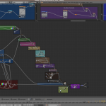
colour noodles are looking very nukeish
Looking real good! :?D
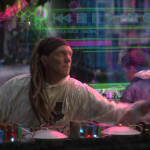
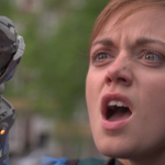
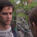
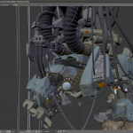
One thing I noticed is that the girls robot hand “cuts into” her face (looks to be closer to the camera than her face). I guess it’s still a WIP (and the roto isn’t completed on it?).
But everything else looks good! :?D
It all looks great already, i want to give some critique though (which most certainly you already know, but just in case :) )
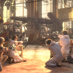
big 15 – hoses need more subsurf and shader, also the ‘graffitti’ thing on it seems rather blurry, chipped paint seems unreal due to missing shader difference (stencil)
Also color variation seems to low, maybe go with a little higher saturation for the ‘graffiti’?
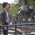
big 14 – looks great, thumb is not really having contact though and the metal looks more like plastic (which it could me made out of too, maybe some new carbon-ish material)
04_3f_1 – the bricks on the left show the same pattern even on the broken parts!
so far my two cents.
i hope
“oude_kerk”! LOL
The file names are part English, part Dutch!
well that’s the name of the church…
who was there from chile! our community is pretty small maybe we know him!!!
Carlos Bertin
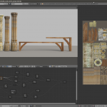
Node diagram is so messy. Ah! :p
(I’d kill for vertically arrangeable nodes (Sockets on top / bottom), or to have more control over snapping to form straight ‘point-to-point’ node set-ups)).
Everything is looking incredibly great though. Really, really outstanding.
Hi,
Amazing stuff, this film has great potential.
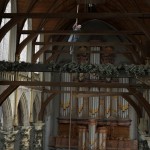
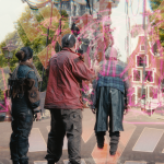
I have just a critic about the scale of the man grabbing the rope in the church, it seems to be incorrectly placed relatively to the wood bar just in front of him. I think he should better be placed just before the piece of wood instead of behind it to be more realistic.
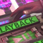
About the playback button, isn’t it too “tuning stuff” to be in such a “scientific” environment ? Plus, its position seems bad relatively to the box just right to it (not thick enough to hide the bottom of the box this much).
Good luck guys, one more interesting film ;)
Sincerely
my addition to the man with rope crit would be maybe the footage of him is too flat and probably needs more contrast and other little similar tweaks