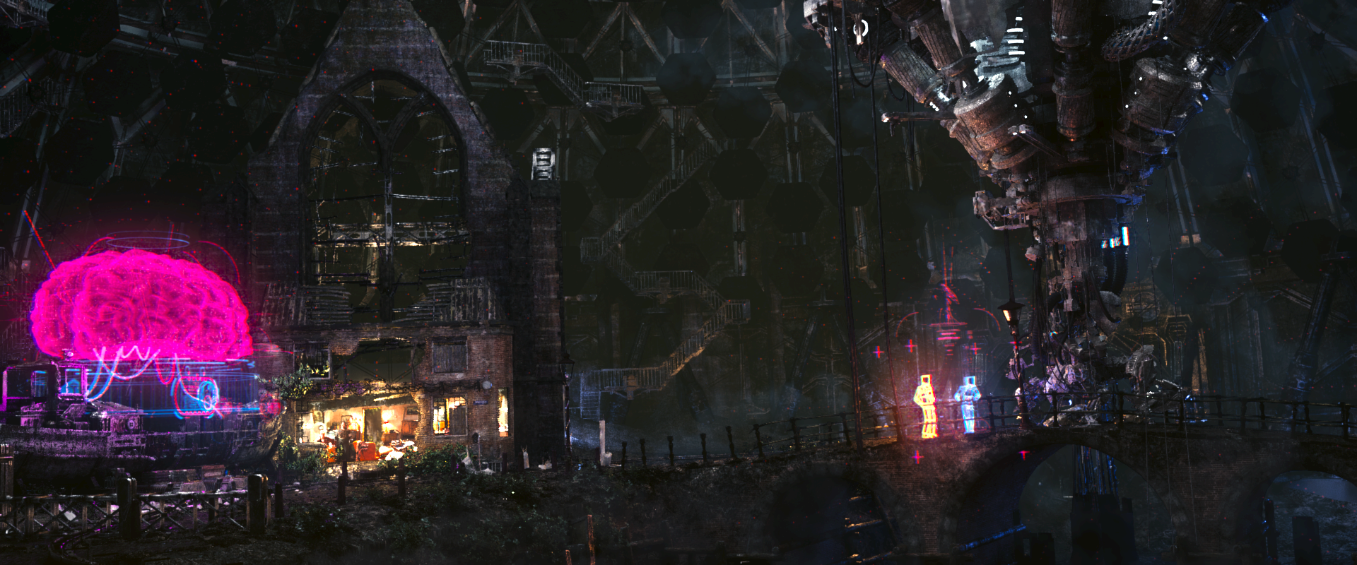
Whaa ! Great work ! @but why that much red point in dome of demise .jpg ?
Is it a cycle issue ?
And what is Ian doing in his chair ?
Nevermind, it’s loocking better and better and all start looking good together ! Still miss some smoke and fire from explosion but would come at time isn it ?
Dunno but whatever you have tweaked its suddenly all looking much better now?..well done. Looking forward to seeing the premiere. I am needs a sauna or something.. ;)
/wp-content/uploads/2012/07/03_3_000341.jpg
I think i can spot a Depth of field issue on the background, the steel structures seem to be much to sharp for their distance.
Epic Ian is epic!
Hey good work guys.
One thing, I already noticed in the teaser, the neon sign on the ship get destroyed by a robot. But it didn’t switch off, even some pices fly around and it’s still glowing. Short twinkle when it get hit and then off, looks better maybe?
But … but … but then you can’t see nyan cat fly! ;-)
On a more serious note: I guess since this is a basically a small easter egg I’d personally just look over this. Especially since it can be explained away by “future” glowing signs that have a longer after-glow or somesuch :-P
In my opinion sign is not a neon tube. It bent from uranium rods. Rods coated with phosphorus, that absorb high energy radiation, and reemit it in visible spectrum. Sign colors is produced by using different composition coatings (like yttrium).
It much cheaper, than to pay electricity bills, because sign emmiting lite many years without external energy source. Also its more ecological because electricity (that power neon tubes) usualy made in environmentally unfriendly way. And rodes emitting lite, even if they broken.
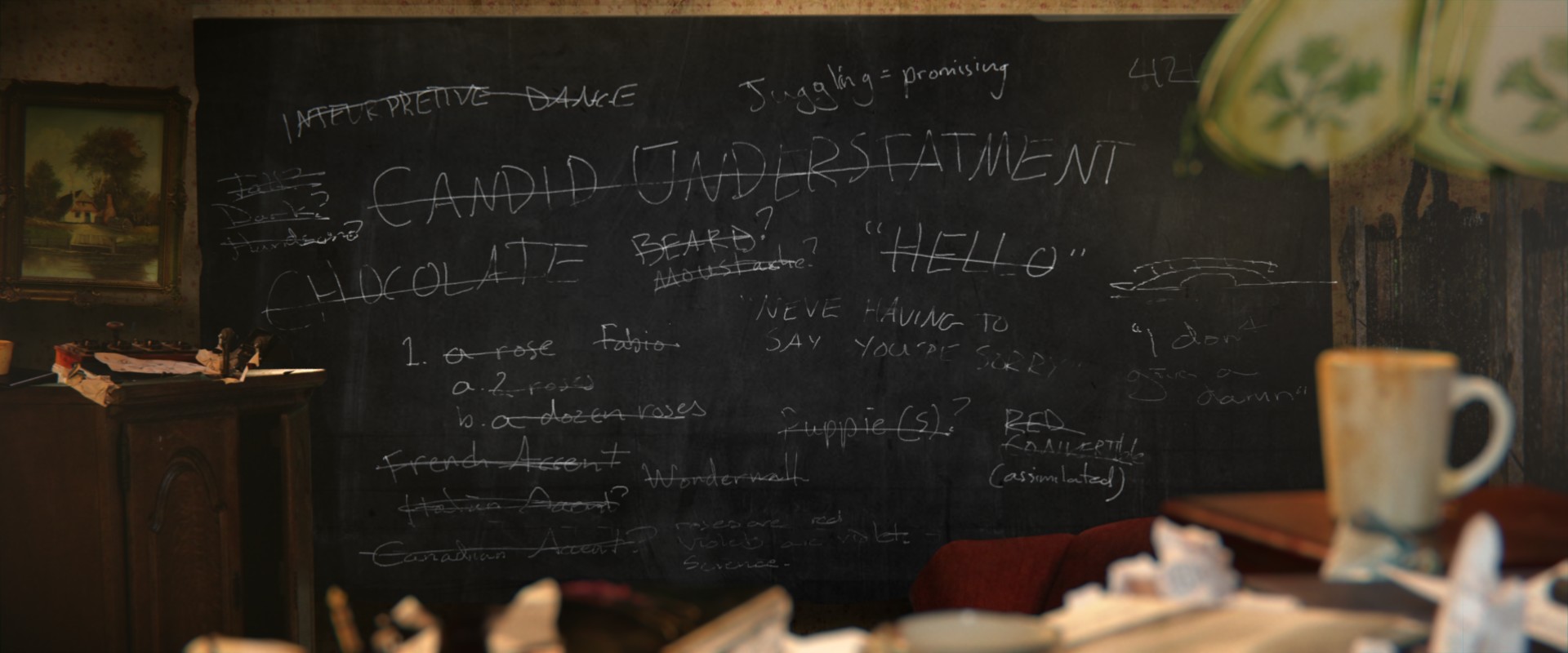
the sintiest shut out is amasing and the blackbourt is very simular to my privat minde map of howe to talk to woman :)
(funny and scary at the same time)
WOOOOOOOOW!!! That looks amazing! …I was wondering if the cycles renders will make the cuts, or will they re-render them? It looks a little staticy, if you know what I mean…
Loving the updates – but if I can lodge one small complaint; the new website layout is cool but utterly borked on mobile devices. Neither my iPhone or Android phone can render the site. My job gives me a bit of down time at intervals and I miss being able to check in to see if there is an update!


It’s all coming together really well.
What is up with Ian in the chair?
DONT QUESTION HIM!!! JK… idk what he is doin…
Whaa ! Great work ! @but why that much red point in dome of demise .jpg ?
Is it a cycle issue ?
And what is Ian doing in his chair ?
Nevermind, it’s loocking better and better and all start looking good together ! Still miss some smoke and fire from explosion but would come at time isn it ?
The holograms are floating in 3D grids marked with the red points. One set for the brain, another for the figures on the bridge.
I think the CG Ian needs a bit of work, his face looks a bit too plasticy. Chair looks good though, good comp.
Wait, is it CG?! o_O
IQ is dropping year by year..
Computer generated, or compiyter graphics.
Dunno but whatever you have tweaked its suddenly all looking much better now?..well done. Looking forward to seeing the premiere. I am needs a sauna or something.. ;)
First-class stuff, boys ! Really top notch ! 10/10 :-)
Ian’s taken the traditional directors chair to an epic new level.
Awesome chair!
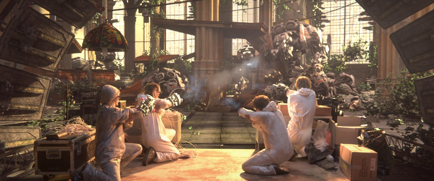
Looking good, but is the one scientist missing his gun arm?
/wp-content/uploads/2012/07/03_3_000341.jpg
I think i can spot a Depth of field issue on the background, the steel structures seem to be much to sharp for their distance.
Epic Ian is epic!
Do the smoke trail from the assault shot also get motion blur? If so, how? Map smoke to cards for vector blur?
U hae sense for humor :D the nyan cat on the ship :D :D :D
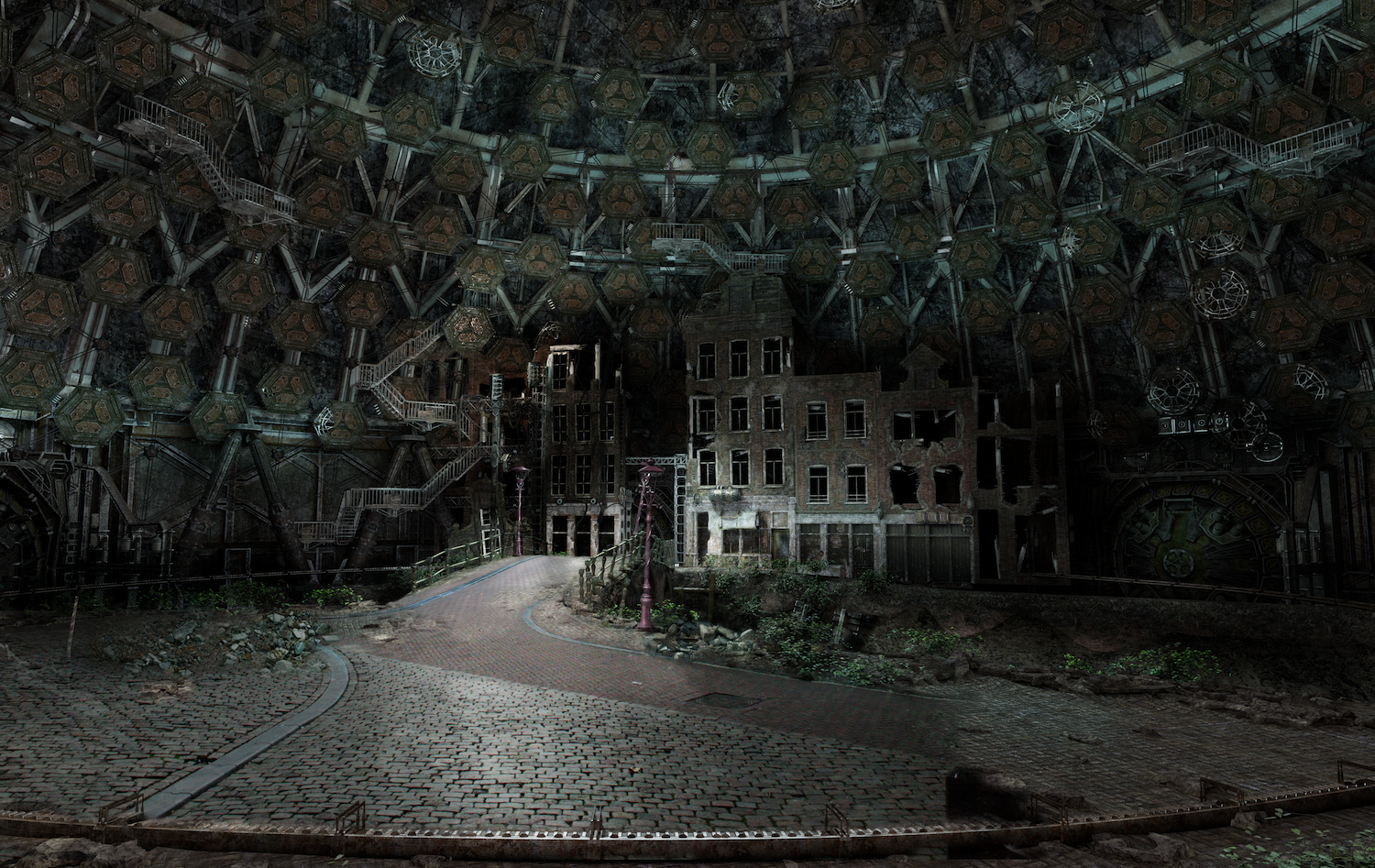
I’m not sure if Dome_of_our_demise is a render or concept..i’m thinking render..it looks amazing.
You should re-read your comment about IQ above. <_<
Why? You have proof its not a render?
If you havent, there’s nothing in common between my comment and the one i was answering to.
I’m hoping it’s not a concept either but I’d say it is. I’m quite happy to be proven wrong because it looks like a finished shot to me.
Hey good work guys.
One thing, I already noticed in the teaser, the neon sign on the ship get destroyed by a robot. But it didn’t switch off, even some pices fly around and it’s still glowing. Short twinkle when it get hit and then off, looks better maybe?
But … but … but then you can’t see nyan cat fly! ;-)
On a more serious note: I guess since this is a basically a small easter egg I’d personally just look over this. Especially since it can be explained away by “future” glowing signs that have a longer after-glow or somesuch :-P
In my opinion sign is not a neon tube. It bent from uranium rods. Rods coated with phosphorus, that absorb high energy radiation, and reemit it in visible spectrum. Sign colors is produced by using different composition coatings (like yttrium).
It much cheaper, than to pay electricity bills, because sign emmiting lite many years without external energy source. Also its more ecological because electricity (that power neon tubes) usualy made in environmentally unfriendly way. And rodes emitting lite, even if they broken.
ok, that sounds plausible :)
Doesn’t sound very healthy… don’t stand too close to the neon tubes XD.
very impressiv stuff (again)…
the sintiest shut out is amasing and the blackbourt is very simular to my privat minde map of howe to talk to woman :)
(funny and scary at the same time)
42 eh?
or Puppie(s) (real sceary if you think about it)
A) a Rose
2 Roses
B) Dozen roses
Not sure if it’s me but the Band-Aid doesn’t look quite right, looks bright where there should be shadow.
Can’t wait for it to come out :D
WOOOOOOOOW!!! That looks amazing! …I was wondering if the cycles renders will make the cuts, or will they re-render them? It looks a little staticy, if you know what I mean…
WOOOOOOOOOOOOOOOOOOOOOOOOOOOOOOOOOOOOOOOOOOOOOOOOOOOOOW!!!
WOOOOOOOOOOOOOOOOOOOOOOOOOOOOOOOOOOOOOOOOOOOOOOOOOOOOOW!!!
AAAAAAAAAAAAAWWWWWEEEEESSSSOOOOOMMMMEEEEEE
Loving the updates – but if I can lodge one small complaint; the new website layout is cool but utterly borked on mobile devices. Neither my iPhone or Android phone can render the site. My job gives me a bit of down time at intervals and I miss being able to check in to see if there is an update!
+1
Hmmm almost one week passed and no new post?
Hey mango-team, what’s the status?:-)
Crunch time! But I’ve posted some images :) A post by Sergey is coming soon too.