My first blogpost as a mango artist; I really like to show everyone the development of the making process.
I started the mango project as a production assistant helping Ton with some production stuff for the shooting days. After that I started modeling. I have been doing this for a long time for myself and now I really like being part of the mango project as an artist.
Down here you can see the development of a couple of parts I’m working on. It’s not finished yet, but I’m happy to share it with you. I’m only doing the modeling and texturing as my specialty is environment development. Today I started working on the city skyline; I wonder if it is possible to make it look photorealistic.

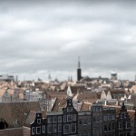
Great work! The cityscape reminds me of Madurodam, haha!
I really love the work you guys are doing. Your making vast progress. It feels like everything is going faster than the last project, but that’s probably because this time you have decided to share everything. One point of critisism, with the (cgi?) shot of the city, please don’t apply the dof. It makes it look like a very small city, like Madurodam. For the rest, keep going on. I love checking up on you guys ;)
Great :). These renders look beautiful. Can’t wait to see it moving…
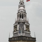
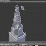
That bell tower looks like an actual photo!
And i also think that the city looks like a miniature.
Wow, these renders are really photorealistic, but I agree to the others that the DOF should be reduced, this miniature effects doesn’t look really good here, would be better to see the backgrounds detail, too ;)
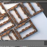
One question:: is this BI or Cycles?
no need to answer my question anymore, have now seen it’s cycles on the screenshots
Also, you’re missing some of the blue haze that you’d probably get at that distance, since it looks like it’s not a super hot day.
The tower is unbelievable! I agree that the DOF is way too high for the city. I think for a normal lense, everything should be sharp (or unsharp) beyond 10 metres or something.
I noticed something strange about the website. Did you guys notice you have two different ‘lightbox/slideshows’ for the same pictures?
Yes, the same here with lightboxes.
And the tower is awesome.
Besides the DOf making it look like miniature, that shot looks photoreal to me.
Yeah, to get the same DOF effect in a real shot, you will need a lens probably of 20 meters diameter :D
Great work, especially on the top two images. I couldn’t even tell whether they were renders or reference photos. The texturing is great!
Amazing how 1 row of houses can stretch, really nice renders. The haze is called aerial Perspective and I guess it will appear in ref photos of location. But future skies may have more pollution ;)
Excellent job so far, I’m following this project with great interest and look forward to the benefits it has for Blender :-)
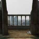
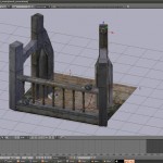
I can’t help but notice the slimline nature of the baluster in the balustrade. Perhaps a little more weight in them would make them feel more stone like? And a greater sense of being grand. As currently they are feeling a bit woody. Typically of stone baluster they are thicker for strength, and also with a larger top and bottom mount (footprint). I think this would do wonders to the scene. I’ve made a very simple and rough gif animation to visualise what I mean if you would like a link posted.
All the best with the rest, it’s going to be an amazing achievement.
Great looking images. Some are really hard to tell if they are real or CG
+1 on the depth of field with the cityscape (although I do love Madurodam)
One little thing would be the floor of the first image (the balcony). I’m not sure if it is the foreground blurring or what, but it doesn’t look like stone. It looks like an applied texture.
I always asked myself with such scenes how you proceed with modeling a city. I know that you don’t model each house, but how does it work ? Is a simple geometry with photo textures and then a lot of duplication ?
If there are any VFX supervisors on this shoot they should have a look at this write up on VFX editing.
https://www.editorsguild.com/FromtheGuild.cfm?FromTheGuildid=309
interesting real world tips.
Hey guys!
Here is a request!
The images on this site takes long time to open.
Can you please save the images in compressed formates (like jpeg) and then post? Its a very good practice in general.
Thanx
What do you mean? I did some random check, and all of the images on the site i’ve looked at were either jpeg or png.
Yes we are taking care of that!
Nice. Don’t forget to change the repeating textures on the balustrade :)
whaa :) impressive : the textures need to be polished a little but looks quite perfect. I wonder just if blender would have a sky builder (like spectral sky in vue) that can illuminate the scene given the sun position but also generate fractal cloud based on some preset.
Cycles does have a sky texture node if that is what you mean.
Almost forgot, tried to use it and also make procedural clouds, but the results are mixed. Ultimately generated 2D clouds will probably just never look very good:
http://blenderartists.org/forum/showthread.php?252586-Procedural-sunset-with-a-chance-of-clouds
lalalalalala. Eps, wow guys..really beautiful rendering ;)
Everyweek I come here, am impress how blender and u guys hav mastered it to a point where it match those xpensiv software out there. Being a student of adobe products and autodesk, this really encourage to perceive my goals of craziness of using/relying on open source softwareS to the max for my works. Thx agn Mango Team.
Feedback about the tower though. I dnt kno but the textures used for the wall looks too much copy and paste style. The building is old, so maybe som borders damaged by time etc. or a brick that got broken/cracked etc ~ Less symmetry.
Especially the “kind of border/extruded semi circle creamd colored” around the small windows.
Gluck and good continuation guys~
The detail on that tower (especially the bricks and roof tiles) is sublime. I’m sure it’s all just textures, but they work really well. Add some good lighting and this will look stunning!
One question: What is the title of the movie???
I think the cityscape could do with a few trees in there, and as others have said, a bit of a mist as it gets further away. I also feel like there isn’t enough color. What I see is all shades of brown/ red, but when cities are made, people aren’t usually paying attention the whether or not their building matches the one down the street. Also the roofs of the nearby houses look obviously textured.Very good though, I can’t wait for the release!
I, for one, love that tilt-shift-esque render people are complaining about! It might even work well as a “time is passing” device in the intro or outro or something, a la this:
http://www.youtube.com/watch?v=ZmLaO9a5lYw
That might not be appropriate for this short’s tone/pace, but it’s a thought…