So!
Sooo……..
We’re making a movie. And it has a lot of VFX shots in it (110ish?). And they were not photo-real enough. So now we’re making everything more realistic! And keeping up with our quote of 50 seconds per week.*
You want to know what’s tricky? Staring at a picture that looks pretty good, but not entirely realistic, and trying to figure out what exactly is off about it.
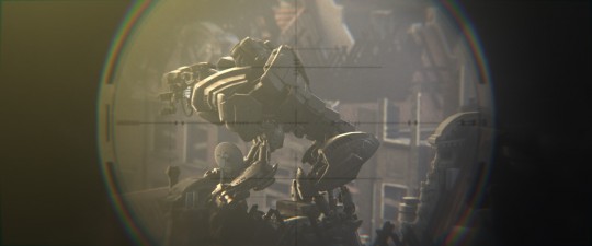
It’s a really abstract place to be. Take a look at the image below. It looks like a reasonably solid game cinematic, but not exactly realistic. But what exactly is off? Of course you can always look at the models and find problems, but it’s something more than that, since the picture doesn’t look any more realistic if you step back and see it from a distance where the details are unnoticeable.
One of the biggest factors contributing to “The CG Look” in general is perfection, or a lack of randomness. You can see in the above picture a lot of the tricks we employed to try to get rid of that: haze, film grain, lens flares, destruction, a wee bit of diffusion, a narrow depth-of-field, angled boards, burned textures, specular maps, image textures, worn down edges on the robot, beveling, chromatic aberration (and though you can’t see it in the picture, some handheld shake shake and lens jitter (nothing distracting)). It’s a smorgasboard of tricks to try to convince you that the image looks too natural to have been made by a computer, and in a lot of cases you can take an fairly mediocre shot, throw some of those tricks at it, and have a great final render.
Though sometimes, as in this case, it backfires. Especially with Blender, chromatic aberration is an infamous cg ‘tell’, and lens flares have been overdone since the 90s.
It’s easy to find details that are off- things being out of scale, modeling being low res- but if a whole scene is looking weird, that’s usually a sign that the lighting itself is wrong. I’ve always considered it a good practice that if you render the scene all gray without textures, your lighting should still work.
Shooting day for night is a reasonably common practice where you shoot during the day, but put various filters in front of the lens to try to make the image look like it was shot at night. It can work reasonably well under certain conditions, but one where it never really flies is when you’re trying to pass of sunlight as moonlight. It’s all about contrast. We know that the contrast between the light and shadow from the moon is far less than the light and shadow from the sun, and we don’t buy it (even if it’s tinted nice and blue).
That was a problem with the above shot. The sunlight’s intensity didn’t have the right ratio to the ambient light’s intensity. So to try to fix it, I brought in a picture from the internet that had the lighting that we were actually going for, and made everything match as well as I could. The color of the haze, the intensity of the light, and the shadows. It was a combination of doing the initial lighting setup in the viewport, then doing the final black-level tweaks in the compositor. At some point I might figure out a more automated way of balancing the sun/ambient lighting intensities, but until then, it’s all just eyeballin’.
Meanwhile, across the room, Rob was remodelling all the buildings like a madman. I don’t want to talk about it too much, since I suspect he’s going to be doing a post soon, but he’s been incredible. He modeled dozens and dozens of buildings and city props. Initially he had burned out most of the roofs in the city, showing evidence of a massive robot war- but trying to get that level of detail and randomness on a citywide scale was proving a bit prohibitive (seriously- just try googling ‘burned building’. and imagine trying to model an entire city of that, that has to be realistic even in close-ups. Super tricky!)
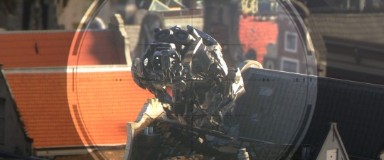
So here’s where we’re at now. Not final, but definitely a lot better. Rob is still going through pumping up the resolution/textures of various elements (I suspect he’ll be irked by my uploading a WIP :P), and a bit of coloring/grading could be tweaked, but it’s a definite step up. You’ll be able to see how the shot finally turns out when we release the upcoming teaser (soon!).
*One of the sentences in this paragraph is a lie.


(according to the “poster”) You’ve mistyped in the title of this post ;)
You can do it!
The reworked shot definetly sells a LOT better already!
Those little details are what bugged me on previous testrenders, this “High Quality Game Cinematic”-ish look, which of course is great work, but still misses that liiiittle bit of ‘magic’ to sell it as real.
Great work ;)
* lol
“chromatic aberration is an infamous cg ‘tell’”
i can’t understand why so much Blender renders have so much CA… having a lot of photographic Lenses – almost none of them has CA that strong. Ok, they are mainly primes of good quality. Some Zoom lenses have CA, but why replicate a cheap lens?
Kind of funny how Photographers work on getting Shots perfectly, while 3D Artists try to get them less perfect ;-)
Nice Blog post, thanks
And those who don’t have good quality prime lenses but kit quality zoom lenses like me can still do a good deal of correcting CA, lens distortion etc in Photoshops RAW converter. I use it all the time to get rid of exactly all the stuff mentioned here.
I have really strong glasses, so I have quite a bit of natural Chromatic Aberration. This makes me more likely to go over-the-top on adding CA because I am so used to it always being there.
Looks good, keep it coming! I bet it’s going to look amazing in context. If you’re looking for an interesting take on making stuff look real, check out District 9. As far as I know they shot on pretty high spec format and then did all sorts of stuff to some of the footage in post to give it a cheaper, documentary feel – mimicking TV news footage etc, which suited storyline and rationale in their case. Obviously that approach might not be appropriate here but may provide some food for thought. Also good execution of live action & CG
I have been watcht a while atbouthe Picktures
and my first impressinon was looks like “Half Live 2”
#1 Every thing feels like the Same Shader (the Szene is in the morning?? art the roofs in the mornig are a littel wet???)
#2 samething in the forground is alsway low poly like the littel chime in the first pikture
#3 and why is the olny the roof broken wher the robot klimt on to???? I don’t wont to say thad you have to burn doun all amsterdam sam missing bricks and hols in the roof will doo and I dont think that a house witch was atackt by gigant robos still got a brand new charger on top… maks no sens to me…
how ever critic is an easy job you are the peopels wicht have to make it “MOAR REAL” but you can do it
2 things immediately jump to mind.
1) Scale needs to anchored, get a pigeon or small bird in there.
2) and it rains in Amsterdam right? get some dirt on those roof lines!
Other than that, looks amazing!!!!!! :)
That would be nice, you get a sense of scale when they are near humans, but anchoring every shot would be nice.
The second shot is definitely better, the lighting is on another level – The first shot looks CG because of a lot of reasons, but the most glaring is definitely the light balance, even if the city was covered by grey cloud you would still get fairly substantial bounce lighting hitting the underside of the robot, and bringing forth a lot of detail in the scene, not to the forefront, but enough to give the brain a lot to take in, which can make all the difference when playing twenty-four frames a second – the light blow-out (Upping the levels) also really helps!
Shaders are another massive part of it, not just the amount of surface detail, but in how the lighting interacts with it, for example the specular component of it is vital as you can really get away with quite a lot if the surface that you are trying to replicate actually bares specular resemblance to the real world object – It’s a very hard thing to balance out though, you can look at references all day long but still miss the mark, I definitely think it’s a lot of trial and error, I’m sure you guys will get there in the end though!
If the budget (Money / time) allows for it, perhaps a way to boost reality in scenes, specifically when moving, is to compositing some dust clouds when the robot is moving around, they could be 2D elements (Stock dust clips) animated in the 3D viewport to match up with the robots movements then rendered & composited with either a foreground mask, or by just blending them over the footage. This could also be used to cover up some of the areas that doesn’t have enough detail to seem realistic.
Awesome work! It does look a lot more realistic in the second picture, but personally, I like that video game cinematic look just as much. It looks better on posters and ads.
YAA = Yet Another “Awesome!”
Looks much better! Dynamic range is a very common problem with cg. That’s why so many HDR images look like cg – because cg has it all wrong! Good work!
Just to add – you need to get the cg elements to fit the camera’s exposure under those conditions.
If I were in charge of lighting, I’d just enter numbers into the thing that have been measured in real life. 100,000 lux in direct sunlight. 25,000 lux out of the sun. Let the environment bounce light they way it’s supposed to. No eyeballing. No subjective tweaking. Just reality in a computer.
Good numbers to know!
But then you’d end up with something that could be argued to be physically correct, but artistically awful ;)
A good proportion of the lighting you see ever day in films, TV shows, and advertising is faked with numerous light set-ups.
Perhaps capturing some HDRI images of the environments that you’s have shot footage in will help pull up the overall lighting (plus reflections and subtle highlights) quality, and believability.
is Lux linear? i don’t think so – if not it makes no sense to use those values in blender…
But the idea of using Real World values itself makes sense.
i might be wrong on lux…
Very, very impressive. Don’t forget about the animation, too. It’s one thing to focus too much on single renders, it’s another to also get the animation “real”. If that robot is suppose to be huge, then it shouldn’t move “fast” as though it was a puppet or miniature. And like another commenter suggested, you could add visual cues like small birds to imply the large scaleness of the robot. Science + theatricality = great illusion and entertainment! :D
A flock of birds startling when the robots run through one of the shots would be very cool. It would add to the size and possibly the scary-ness of the robots.
Yes, some birds or moving stuff will definitely add more realism…
Really nice shoot!
That image is seen through a telescope, so looks like the atmospheric perspective is missing (everything should be more “bluish”, because several “layers” of atmosphere are visually compressed from the point of view to the target); and, all the shadows should be more sharp, now they are blurred, giving the idea of a very close light source (and therefore that you are looking at a miniature).
My 2 cents. :)
“and, all the shadows should be more sharp, now they are blurred, giving the idea of a very close light source (and therefore that you are looking at a miniature).”
Indeed! Specifically, the sun and moon both have a diameter of roughly 0.5 degrees of the whole sky as seen from earth. I believe in blender, the sun lamp’s “size” parameter represents the size of the light in radians, so your sun lamps should all have a size of roughly pi/360 (you can actually enter that directly into the field) for correct shadow blurriness.
Or it might be pi/720, if the sun lamp’s size specifies the radius rather than the diameter. You should check with Brecht.
That is assuming a clear sky where the sun is not blocked by clouds. If it is, you must take into account the diffusion of the sun through the clouds (like a big softbox).
Especially in the second take of the image, the sun is clearly shining brightly on the roofs and on the robot. No cloudy overcast, at least so it looks to me.
The robot looks like a toy to me. I think it’s a combination of the shading on the houses and the DOF.
one thing I notice is the robot seems like it was scaled up or the buildings scaled down….adding some very small details that people can associate with and recognize easily would add to the realism….also there are some other things that do not seem to fit on that scale of a robot…like the wire covering(tubing) to me just seems out of place….also those roofs would collapse under that kind of weight…but hey, it’s a movie and should also have some freedom….these are just some ideas all in all it looks really great though and in motion will make all the difference in the world as well.
Here are some things i noticed, which may help imho.
Annotated image :http://cloud.dinfiber.de/public.php?service=files&token=a9e023f519a73f7c8a6e9c0c95f67559aa632e90&file=/IMG_20120629_133707.jpg
1: Too much DOF looks like a miniature. Sniper scopes are usually zooms not tele. And if it were a tele-lens, the scene should be much more compressed with even more DOF. Here is an example of a normal zoom-lens sniper scope
http://i.ebayimg.com/t/Russian-Mosin-Nagant-91-30-PU-Sniper-Scope-Bag-Mount-Base-All-Steel-RSM-/00/s/Nzk4WDEwMDA=/$%28KGrHqZHJEME-nGtZjckBPy13I5GKQ~~60_57.JPG
2: Too less detail, some areas look really flat.
3: Too saturated / color-bleeding. Same, but not that much on the roof to the left. There should also be more contrast in that area. It looks like a flat texture
4: Same as point 2. really looks like a flat texture and not like geometry.
5: Almost the same as 2 and 4. the dropshadows under the cornice don’t look right. it doesn’t really look like an inset, but like a flat photo.
Btw, what look are you aiming at? photorealistic in the sense of “It could be shot by a private person with an ordinary digital camera”, or photorealistic in the sense of the Hollywood-cinematic look everyone expects when going to the cinema? Because we are soooo used to this kind of realism that our brain tends to accept it as real.
If the last one is the case i would try to add some bleech-bypass effect.
Maybe you could release the file of one particular so everyone can start to tackle with it. Maybe some kind of “contest”. You would get a lot of variations to pick the one that fits the style you are aiming at best.
Just my humble opinion.
Best regards
Linny
Sorry, wrong annotation image link
Here is the correct one:
http://wstaw.org/m/2012/07/07/03_3c_0007242.jpg
“I’ve always considered it a good practice that if you render the scene all gray without textures, your lighting should still work”
That’s why we usually shoot a gray ball on set with the HDRI. First step match the gray ball lighting (diffuse, spec, direction, … ).
Looking awesome so far!
How about rotating the scope texture a little bit? It seems like a scope sort of thing mounted exactly to your camera..
You might have a look through a real scope and then try to reproduce EXACTLY what you see with your eyes.
And also I agree with Qazplm, the DOF looks a little bit too intense, makes it seem toy-like…
The telescope would have to be half a meter wide to have this shallow depth of focus… these values are easy to calculate exactly if you know the distances.
And in my opinion, chromatic aberration (and even barrel distortion) is completely appropriate for a sniper view, but not a bit for the rest of the movie. Or do you just feel the camera you used was far too good? :)