My first day working in the institute is finished! This morning I finished polishing up the next draft of the script. I’d been chewing on the first version for a while, and realized it suffered from being spread a bit too thin, and dramatically detached (non of the stakes directly affected the main characters). It seems like the best changes are always obvious in retrospect (‘does the protagonist have a ‘motivation’?’) I consolidated the scenes to take place in only two locations, and brought the antagonist into the same scene as the protagonists, and the story is now a lot stronger!
That said, while the variety of visuals in the film have been pared down a bit, the improved quality/impact of the ones remaining should make up for it. Barring an awesome modelling sprint, our real superpower is development/quality- not modelling on a massive scale. I think it will demonstrate Blender’s abilities a lot better if we have a few great showcase locations, as opposed to trying to model everything under the sun. I can say now, we’ll definitely be doing a lot of digital set extensions and augmentation, requiring lots of motion tracking, keying, rotoing, and destruction simulation!
What’s exciting to me is that we’re not just going to be putting cool CG augmentations into Amsterdam, but that we’re going to be putting them into the coolest parts of Amsterdam. We’ve been scouting old churches and other places filled floor to ceiling with great textures and lighting, so that when we add in our details on top of it, every frame will be rich. When you’re shooting as high res as we’re going to be, you don’t want to spend a few million pixels of screen real estate on a bland T-shirt!
I just wrapped up a meeting with Ton, where we went in depth through the entire script, and I’m also getting some very good comments from the team, so with any luck we’ll have a locked script in a day or two!
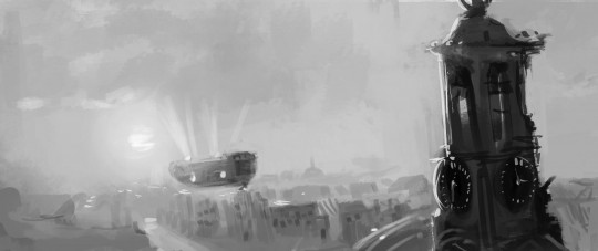
Until then, here’s a cool frame from the storyboard David drew, showing an early concept for one of the opening shots. Working with David has been amazing. His hands have to work so fast to keep up with his imagination! He didn’t sleep at all last night because he was busy drawing 26 amazing panels like the one you see below- then he spent all day doing more concept art! He’s finally sleeping. It’s so incredible to be able to work with such a talented artist.
Talk to you soon!
Ian


Oooh old churches with sunlight seeping through filmed with RED 4k drooool.
good job and i like blender
Nice one! i think your choice will pay in the long run. Less is more :)
BTW…are giant robots still part of the plot?
Navy seal Bag packed guys who are walking around A’dam, fighting against big machines who has taken in the city. Blender in control perfect story. This is really a teaching story who wants to work with Blender.
That sounds very wise, you don’t want to do Sintel-like compromises on a 4K VFX project.
Btw, will there be a 4K screen at the Blender Institute so the artists can check their work in full-res?
Very cool. Just an ignorant suggestion, please – at some point in the short – make the viewer aware of the grand scale. I’m not talking about scenes and scenes, even just a fleeting 3 second shot that conveys the enormity and grand scale of the premise.
Culling things back at this stage to improve the quality of the remaining shots is about the best news I could hear about this project so far.
Epicness != location count
:)
Yes! Keep the locations few! Go for quality, not quantity! That was the biggest problem, IMO, with Sintel’s production. We really bit off more than we could chew.
2 locations sounds very good!