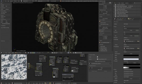
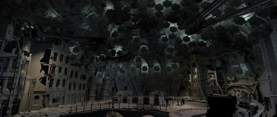
It’s texturing time for the dome , except for the scientist boat and a few props still needing more polies (the silos and boxes in a corner), I’m now setting up textures : a first pass tells me if the object is detailed enough and whether it needs more mesh detail or more refined textures.
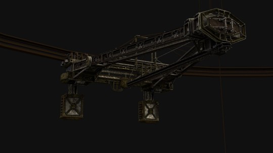
An example is the bridge , right now it’s quite low poly for being in the center of the set , but textures are going a long way , and right now it doesn’t seem to require crazy high-poly sculpting , but rather a solid material and some greeble models as filler (cables, lamps, and misc. tech probably)
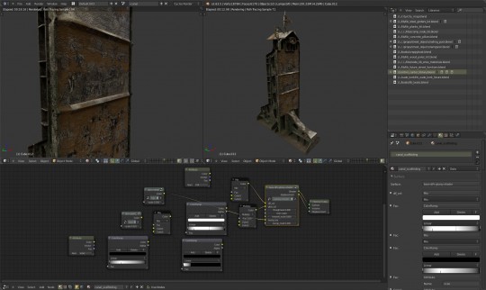
So here’s some individual renders dome props , you can see some of the nodes used : they are just groups (made using trunk cycles, no custom or secret code :D ) .
I’m really excited about the current texturing/shading possibilities: thanks to batchbake, vertex color channels, blended box mapping, nice tileable textures and the flexibility of Cycles nodes … you can get really nice materials, really quick.
Hopefully this will work nicely (as in technically stable and manageable) and make lighters/shaders happy (using groups heavily is now making these materials way more readable !)
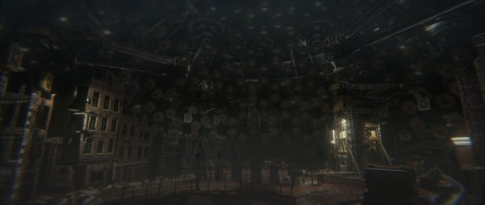
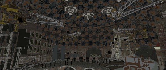
And here’s a render plus its 2 main shading channels : again this lighting and compositing are temp , but I need a rough render to work with and then look mostly at the diffuse channel (3rd picture) to see if materials are balanced correctly : if something is too dark or saturated it’s not always trivial to decide if it’s the texture or the lighting that needs changing , but for sure when ‘colors’ (dif and spec) will be better balanced all over, this thing will light much better.

Hi Ni:Zu.
An interesting combination of nodes – Attribute, Color ramp, Mix and bbm. You can tell what makes this combination?
Yes, “BBM” stands for blended box mapping , that’s what Kjartan set up based on a Neil Blevins tutorial, and it’s a basic world-scale cube mapping with the extra feature of blending the projected image along the seams of the reference cube (in practice, nice looking generic mapping without need for uv unwrap)
The attribute node gives a vert color channel (used for base color or -in this case- AO )
The color ramp is used so that the vertex color ao (which is a smooth gradient) gets blended in its grey areas with that ‘bbm’ tileable grunge to add detail and turn simple AO into a dirtmap with more character (mud splatters , metal scratches , etc..)
Cycles is new and fascinating for me so i’m still veryifing and testing all these techniques -which are sort of standard but also it’s new for me to apply them to modern raytracer with nodes.
Soon i should record some screencast and tutorials (…that is , if linking issues and other technical aspects don’t make everything blow up in my face .. i hope not :D )
already achieving a great and cohesive mood in the rough render!
Somehow I still can’t imagine the actors in this environment. Well, I am eager to see the magic happen!
So does this mean it might be possible to render this scene on a GPU because your tileable textures might actually fit in RAM?
That’s the idea: tileable textures (in multiple layers) vs. full unwraps means reusing more , and the overhead of doing blending operations is less of a problem , especially as the the scene gets bigger , the kit of tileables remains the same and the controlmaps (mask and dirtmaps) can be relatively low res.
So far i haven’t hit the limit of 6gb on a Tesla , and most of my textures are generously oversized (many 4k) so i’d say its working nicely.
Just wondering, why is chromatic aberration applied so much and so heavily in the Blender Community? I find it to be plain ugly, but that’s just my personal opinion obviously.
Looks great!
How long render this scenes by cycles?
Hi this took 20 mins at 2350×1000 on a Tesla (about 15% slower than a GTX580 , but has 6gb ram )
Lamsp are square areas with mesh lampshades to simulate spotslights , with sizes from 0.8m to 2m.
A week ago the dome was rendering in 40 mins but doubling lamps size made to a huge difference (not sure how the final lighting will be technically)
Also The “light falloff” node helped :http://wiki.blender.org/index.php/Doc:2.6/Manual/Render/Cycles/Reducing_Noise
Thank you very much
:)
It all looks brilliant. The only criticism I would have is that the chromatic aberration is somewhat strong, perhaps if it was toned down it would look better. Any chance of having lots of lens flares (J.J. Abrams style) in the movie?
Well plenty of wide angle lenses have bad CA, no surprise the the Blender Foundation can’t afford to rent really expensive glass ;)
I have to agree with the CA criticism…even for this wide an angle, I think it looks pretty weird. While I respect it as a creative choice, I hope it’s not as severe in the final film.
That aside, this looks fantastic. I’m really looking forward to the film and playing with the production files!
yeah, all of them looks fantastic :)
and the texturing is really awesome but as everyone is saying there are seriously too much chromatic aberration. As if being filmed from a cheap camera :/
About chromatic aberration :
I agree :D
I bumped the dispersion from 0.02 to 0.035 and raised exposure before the last batch of renders and whoa..
This and lens flares : it’s funny how jokes about J.J.Abrhams’ tricks are quite common with the team too , i guess we all know these effects are cheap and easily abused .. but honestly helps selling the picture as real , so it’s a big temptation to go overboard.
The final look ? i think will be very different , and i’m very curious , i’m just doing my tests renders here , lots of people on the team can (and will) add a lot to these !
Aye! As far as flares go, I think having a bit of appropriate light bleeding in from the sides of the frame can really sell a shot and give some great looks- but I’ve kinda fallen out of love with having visible artifacts moving across the screen, unless if it really makes sense.
this looks great! cant wait to see the movie)
Also I love blender’s theme on screenshot. Can you share it?
Hi,
It’s available on pasteall , for the moment :
http://www.pasteall.org/31313/xml
Save as XML into Blender’s themes folder :
.blender/2.63/scripts/presets/interface_theme/
Credit goes to the author of Blender zbrush-like theme in trunk , this is just a slightly modified version. (please post if you know the name , i still need to ask/check)
thanks! Actually I tried to find something myself, but google search gave me nothing interesting